

10 Easy Hacks to Polish Your Book Cover's Text

One of the worst offenders on self-published book covers tends to be the text. I’ve seen a thousand covers with great photomanipulations or artwork, only it’s (to be perfectly frank) totally ruined by the way the text is added.
Does that sound too dramatic? Probably, but I tend to get very dramatic about book covers. You’re talking to the person who got up from her desk THREE TIMES yesterday to rant to her husband about the cover I’m currently working on. I even waved my arms in frustration.
No, but really, if there’s one place where a designer can’t get away without levelling up their typography skills, it’s book cover design. You should be looking at the imagery and the text as two integral parts of a whole. The imagery doesn’t make the cover, and the text doesn’t make the cover. It’s the two of them working together.
So you can’t just create the most gorgeous image known to mankind and slap some text overtop it without thinking. You have to create the imagery with the text in mind and then knit them together as one organic piece of artwork.
Text should never be an afterthought.
And the reality is that typography is a whole science in and of itself. If you went to school for graphic design you’d take at least one entire course on it. So… how are you supposed to get a grasp on it without spending that kind of time?
I mean, if you’re reading this because you want to become a professional cover designer, you should probably definitely spend, like, a lot of time studying it. For all you authors looking to spend most of your time writing, I have your back with 10 easy tips to make your text look more polished in less than an hour (for the most part, at least).
1. Expand the tracking.
“Tracking” refers to the spacing between the letters. If you take a look at nearly any professional cover, particularly at the author’s name, you’ll notice that it’s more spaced out than the font default. Sometimes way more spaced out. In fact, one of the common betrayals of an amateur cover is when the tracking hasn’t been modified.
Playing with that spacing can be used to great effect. One of the benefits is that it increases the amount of “white space” (empty space, or in the case of a cover, maybe an area where the artwork is less busy but it’s also not filled up by text). White space gives a viewer’s eye some room to breathe and relax, as opposed to dense, dark text that makes a design heavy and overwhelming. It also gives a cinematic effect, a sense of epicness.
As an example, take a look at this same cover with expanded tracking (left), as opposed to the default tracking (right). The one on the left is so much easier and more pleasant to read!
You can expand the tracking using character settings in any serious design software like Photoshop or Affinity Photo. You can even do it in Microsoft Word, though I don’t recommend trying to make a cover in Word!
If your software doesn’t have that functionality, one workaround that I used to use in paint.NET (a free photo editing software, with limited functionality) was just to hit the spacebar between every letter. Not perfect, but better than nothing.
2. Put your author name in all caps or no caps.
I often see author names with the initials in capital letters but the rest of the names in small caps or lowercase. For most genres, the lowercase letters don’t look great, and I would say that the small caps essentially never look professional. I’ll qualify that by saying there are always exceptions, but exceptions prove the rule, right?
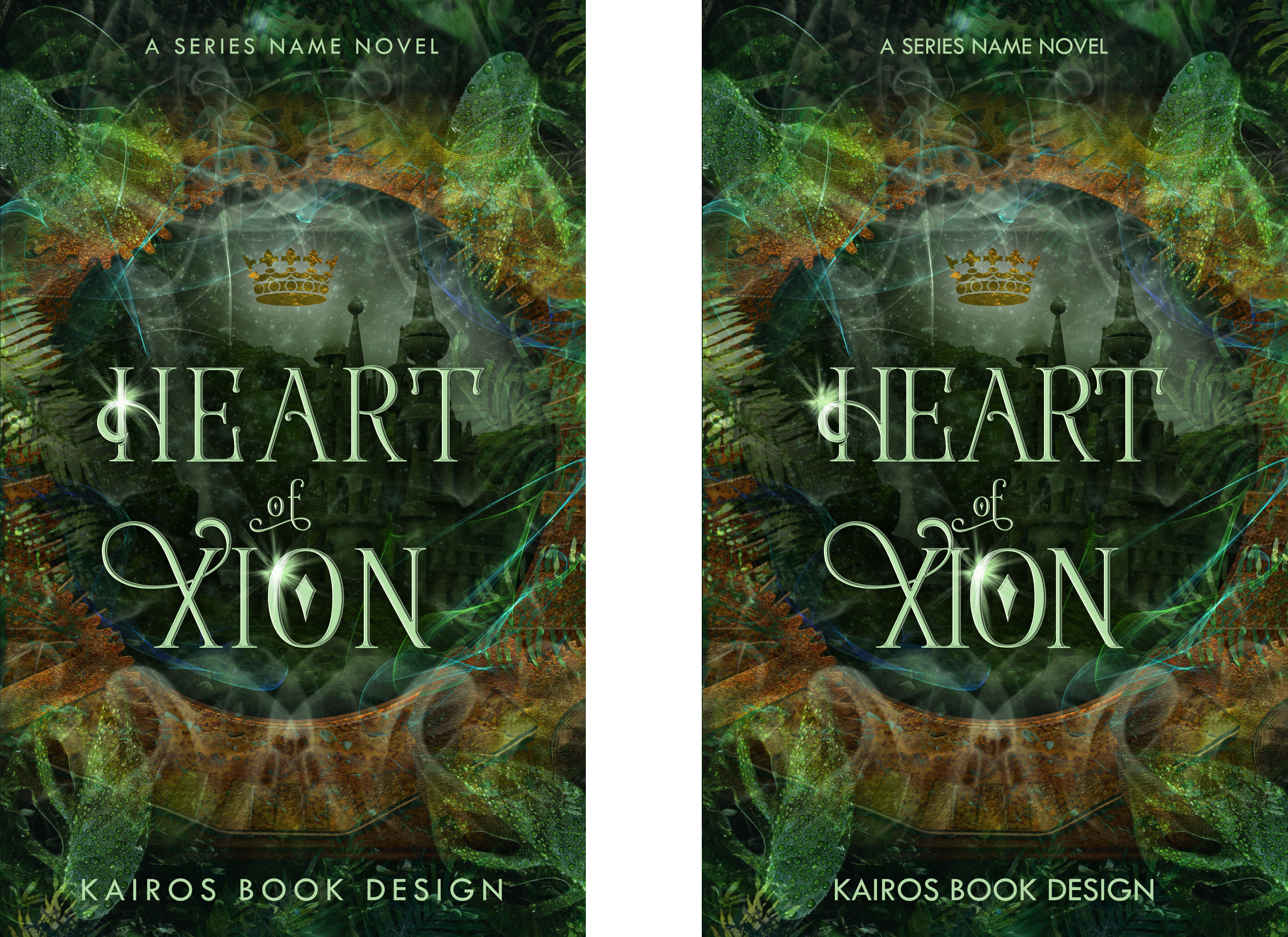
Notice on Heart of Xion above how every letter in “KAIROS BOOK DESIGN” (the placeholder for the author’s name) is the same height, rather than the K, B, and D being larger than the rest. That’s what I’m talking about.
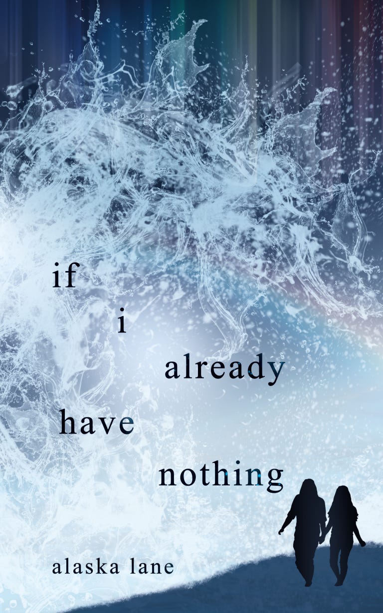
Instead, I strongly recommend going all caps for the vast majority of covers, or going all lowercase if you want to make that stylistic choice. One genre where all lowercase works well is poetry, like the cover below.
3. Don’t align text randomly.
Another instant brand of an amateur cover is when text is haphazardly placed with no reason. Oftentimes, it’s shunted into an awkward position to accommodate artwork which wasn’t created with the text in mind.
Like I talked about at the beginning, text is integral to a book cover, so you should never sacrifice it for the sake of the imagery. Instead, rework the imagery so that there’s a natural and logical spot for the text. Usually, you’re going to want everything centred on the vertical axis.
Again, there are exceptions which prove the rule, like if i already have nothing above. But even that placement isn’t random: I was extremely deliberate with the precise spacing and positioning of each word.
Another egregious offender is when the title is aligned towards the left but the author name is centre-aligned, for no stylistic purpose. Trust me, people can tell.
4. Avoid crutches for readability.
If you need a severe drop shadow, a text outline, or a bar of solid colour beneath the words to make your title or name readable, you've chosen the wrong text colour. Or you’ve used an image with the wrong composition; in other words, it doesn’t contain a space where the text fits naturally.
While a subtle drop shadow can help your text stand out well from the imagery if the text is already an inappropriate colour, it should never be used as the sole way to make your text readable. And outlining your text almost always looks amateur, as does using a bar of colour beneath it to make it stand out. It’s the perfect signal that your image and text don’t flow together into an organic whole!
Instead, make sure your imagery contains a natural spot for the different text elements to sit, and choose a complementary but contrasting colour for the text.
5. Add a tagline or endorsement.
Adding a bit of extra text adds an instant flair of professionalism. Look at traditionally-published books and you’ll see that many of them have a little tagline or a quote from another author endorsing the book. This is an easy hack to level up your cover in seconds!
Just make sure to place it in a tasteful location and keep it small enough that it doesn’t distract from your title and name. Since the text should be small, it’ll also need to be in a high contrast spot, like light text on an all-dark background or vice versa.
6. Stop using system fonts.
Want to know the easiest way to brand your cover as homemade? Use a font that came pre-installed on your system, like Calibri, Papyrus, Viner Hand, Lucida Calligraphy, Times New Roman, etc., etc.
Or, use a font that’s been done to death in your genre, like Cinzel or Trajan, or Playlist Script (that one you see ev-er-y-where on Canva graphics).
Instead, research comparative titles for your book and take note of the types of fonts they use. Then browse sites like Creative Market or DesignCuts (or even free font websites, if you must) to find similar fonts that you haven’t seen too often.
Remember to check that whatever font you use, you get a commercial use license for it, or you could get in legal trouble.
(Again, I “broke” this rule by using Times New Roman on if i already have nothing above. But that’s poetry, and poetry breaks all the rules! If you’re going to break a rule, you need to do it deliberately and for a Very Good Reason.)
7. Don’t put “by” in front of your name.
Although you’ll see “By So-and-So” on a lot of children’s books, it rarely appears on adult fare. Including those two little letters on your cover is another instant way to mark your book as self-published.
8. Give the text some room to breathe.
I’ve seen many self-published covers where the title and author name are jutting right up against the edge, with barely any room to spare. This just looks bad. And again, it’s usually because whoever made the cover was afraid to shrink or cover up any part of the artwork.
I’ll say it once again: if your artwork won’t allow for a graceful addition of text, it’s not good artwork for a book cover.
If you don’t have an eye for placement, here’s a quick hack: give at least enough clearspace between the text and the cover edge that you could fit another line of text there at the same size, with a little room to spare. Like so:
9. Reconsider text placement.
I frequently see people place the title at the bottom and their name at the top. My hot take is that this nearly always unbalances a cover—it really bothers my eye!
A lesser offender is having the title near the top and your name at the bottom. Better, but it still often doesn’t look quite right unless the size, style, and colour of the title are perfectly balanced with the artwork’s focal point.
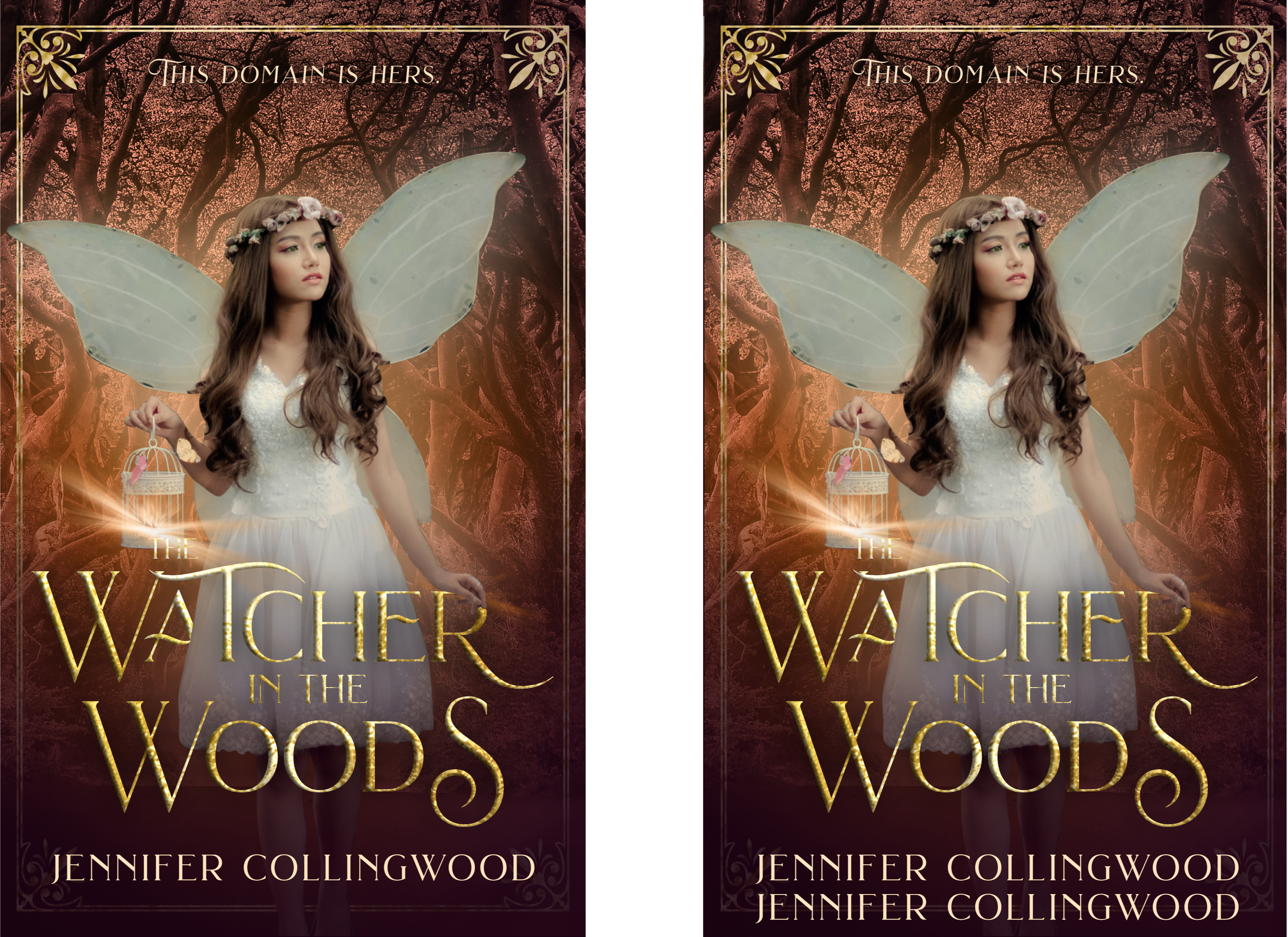
Instead, try placing both below the focal point, with title above name, as in The Watcher in the Woods above. Or, of course, you could make the title the focal point, as in a typography-based cover like this one!

10. Use different but complementary fonts.
Putting the title in a serif font and the author’s name in a sans serif is a tried and true way to spice up your cover with a little variety. You can get fancy with a few swashes on the title (don’t go overboard; less is much, much more here).
Don’t use two different serifs—they often clash—and make sure the weights of your fonts are appropriately balanced.
For example, don’t use a thin, lightweight font for your title and a heavier font for your name. However, you could use a heavier font for the title and a lighter one for your name. This is called “text hierarchy”: the most emphasised piece of text should be the most important one, and unless you’re Stephen King, the most important one is not your name.
Pro tip: don’t use more than two fonts or maaaybe three. That’s too much variety!
As I mentioned a couple times throughout this post, there are exceptions which prove every rule. Remember what they say, though… you have to know a rule to break it. Some of these tips might not work for your book or its genre, or you might want to deliberately shake things up, like in the case of a poetry book—a genre which frequently pushes boundaries on purpose.
For the vast majority of genre fiction, though, these tips and suggestions will serve you well, and solve many of the problems I consistently see in author-designed covers.
I’ll leave you with my oft-repeated mantras: always check traditionally-published standards for your book, and always research what comparative titles are doing.
I hope these tips gave you some helpful ideas you can implement quickly to level up your cover! As always, if you have a question or topic you’d like me to cover, let me know in the comments or email me at benita@kairosbookdesign.com. And keep scrolling for resources and recent cover reveals!
Resources for you
10% off any of my cover design or formatting packages or premade covers - just let me know in the order message what email you’re subscribed to this newsletter with!
Pro tip: all my premade covers are already 50% off the original prices to make room for the upcoming Fall 2023 collection. You’ll get an additional 10% off that discounted price if you’re subscribed!
$5 off a cover design or formatting critique from me - just let me know in the order what email you’re subscribed to this newsletter with!
Make sure to let me know anytime if you have a question or topic you’d like me to cover in a future newsletter!
Recent cover reveals

Divided by T.J. Fisher is a no-spice romantic fantasy releasing on October 15, 2023. I love the simplicity of this cover, with the subtle depth of the scenery behind the background colour. The rich purple and silver were my favourites to work with!